Observation
Users left at multiple steps, not only at the paywall.
Moneko · Overview · 01
ScopeResearch, UX Strategy, UI Design, Iteration
Moneko is an AI-powered budgeting app. As the Product Designer, I led the onboarding redesign to address early drop-off and help users discover the product's value before deciding whether to subscribe.
Users were asked to subscribe before experiencing Moneko.
The original flow introduced personalization, account creation, and a paywall before users could meaningfully try the product. I asked: How might we help users experience enough value before deciding whether to subscribe?
Research · 02
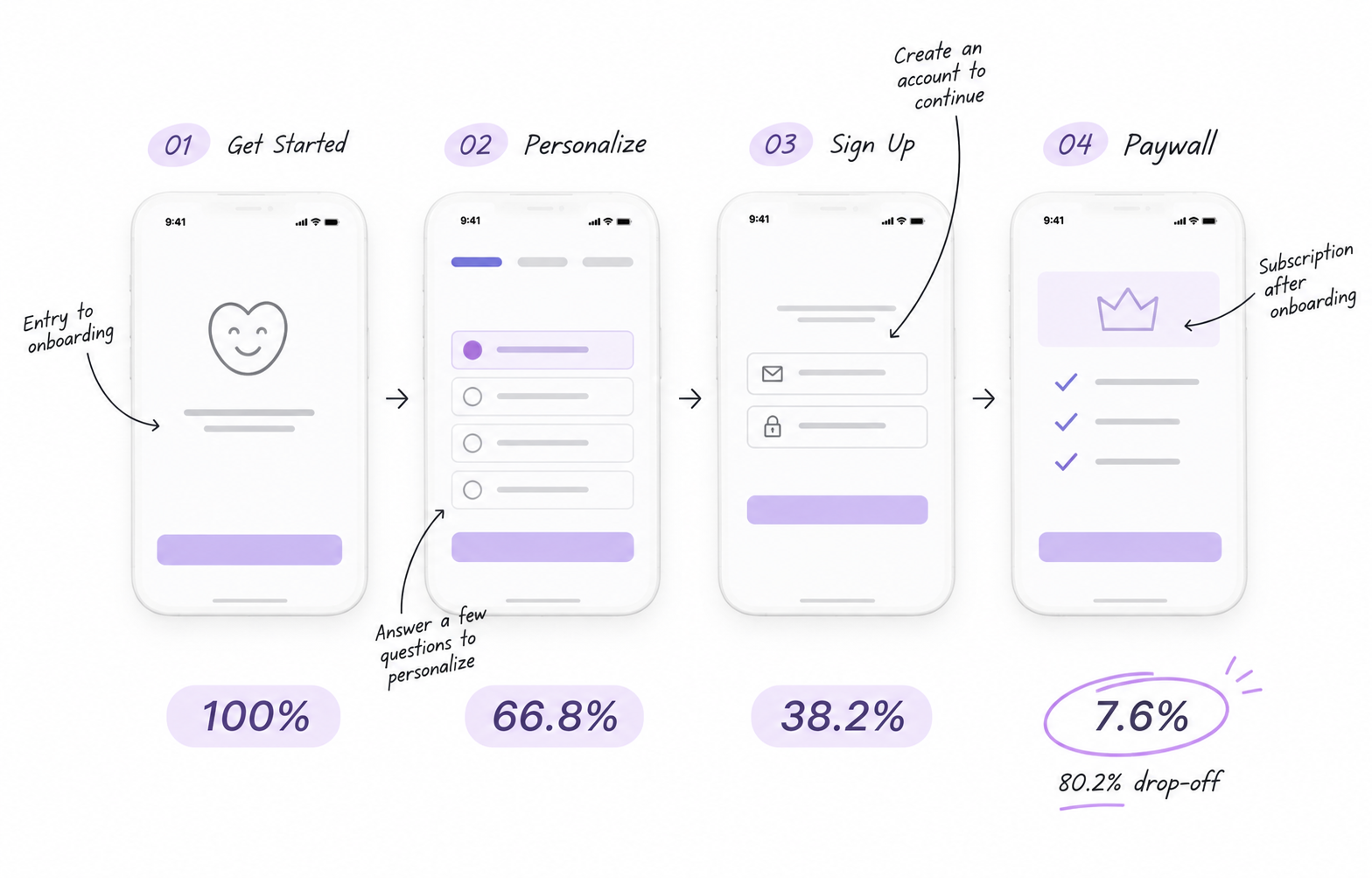
Illustrative interpretation, not validated emotional research.
Curious and motivated
Still interested, but more effort
Increasing friction
Hesitant to pay before trying
Users left at multiple steps, not only at the paywall.
Questions and account creation added effort before users could try the product.
Did users understand enough value to justify committing?
Experiencing the core product before payment might improve activation.
Let users experience value earlier and introduce the subscription after activation.

“I want to see how it works first.”
The funnel showed me where users were dropping off, but it didn't explain why. When I came across this feedback, I started questioning whether we were asking people to make a subscription decision before they had a chance to understand what Moneko could actually do for them.
I saw two possible problems: the onboarding journey might have been too long, or users might not have experienced enough value to feel ready to commit. Rather than assuming the paywall was the only issue, I wanted to explore both possibilities.
Iteration 01 · V1 → V2 · 04
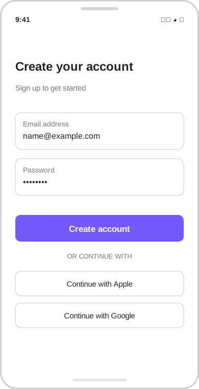
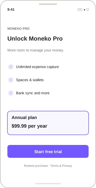
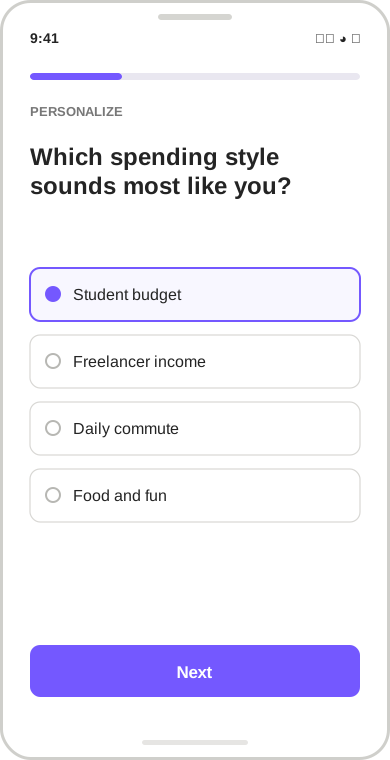
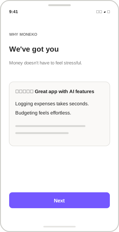
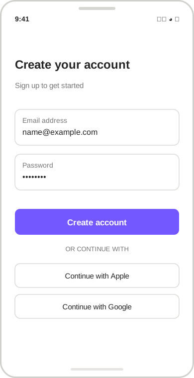
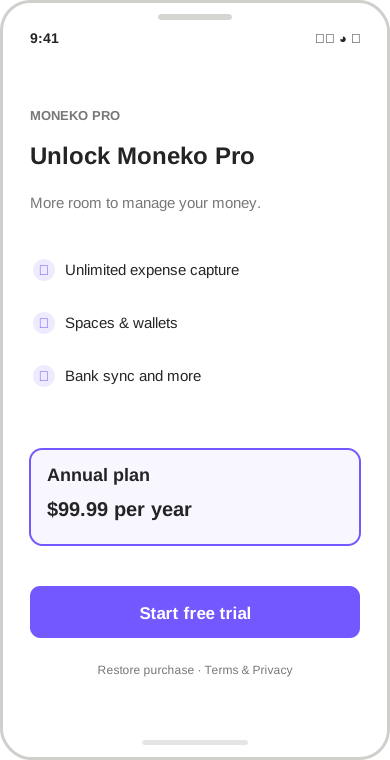
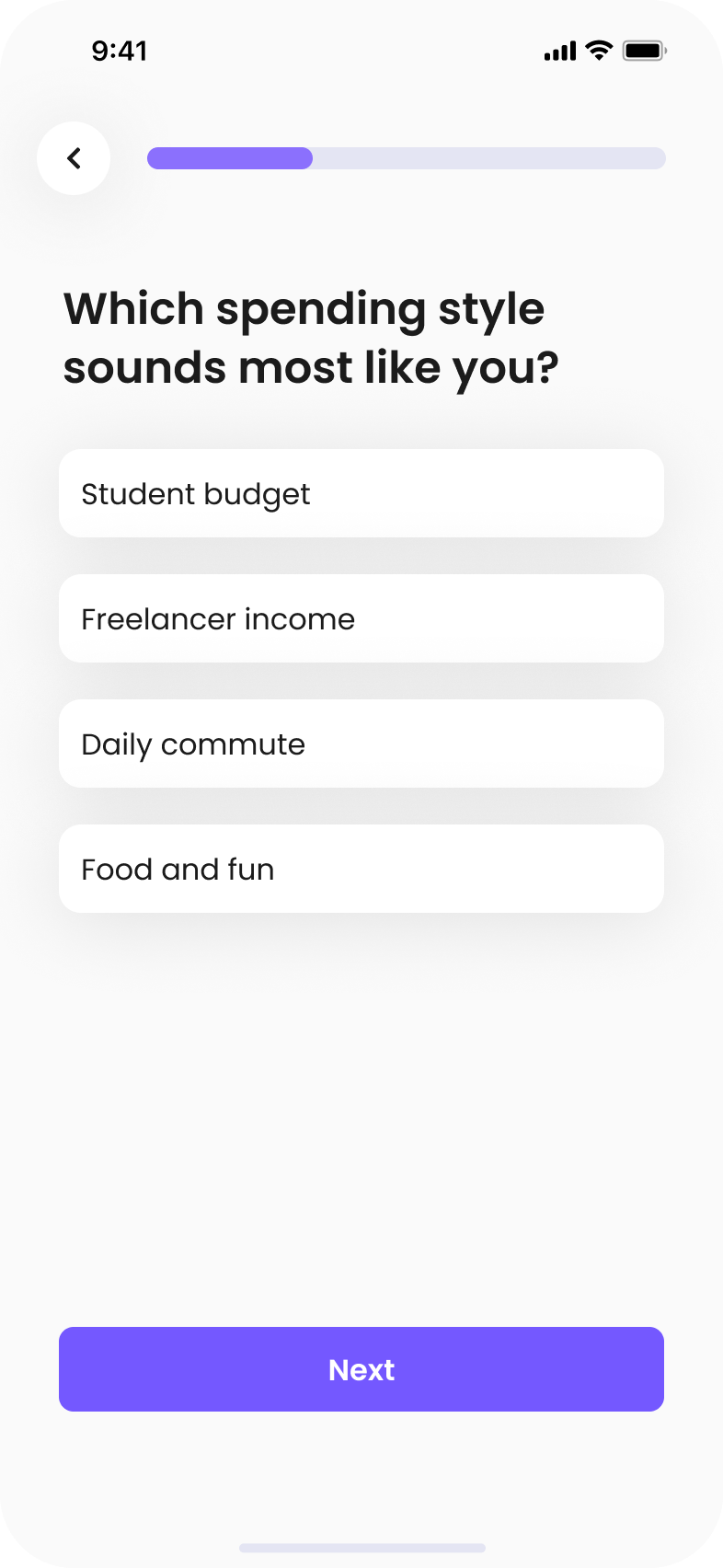
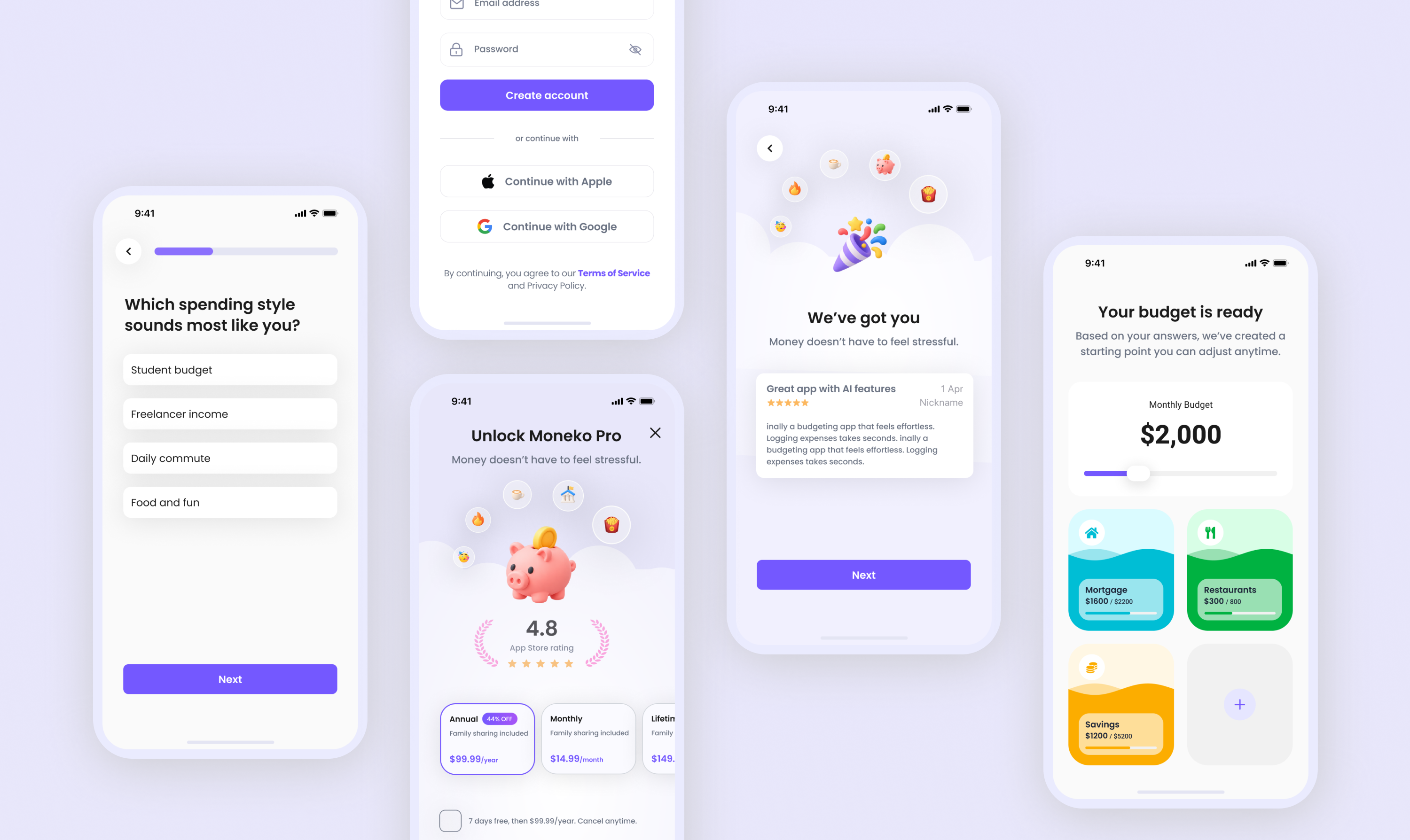
I first thought clearer explanations would help users decide. V1 moved from account creation to the paywall; V2 added personal questions and a value explanation before login.
Shorter path to the subscription offer.
Users were asked to commit before experiencing the product.
Swipe to see all four screens →
Introduced the product's value before asking users to subscribe.
Added steps without letting users experience the core product.
“I want to see how it works first.”User feedback · Moneko onboarding
More explanation could help users understand Moneko, but it couldn't replace experiencing the product.
Explore ways to let users try core features before committing.
Iteration 02 · V3 → V4 · 05
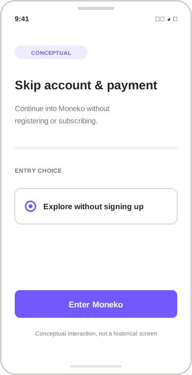
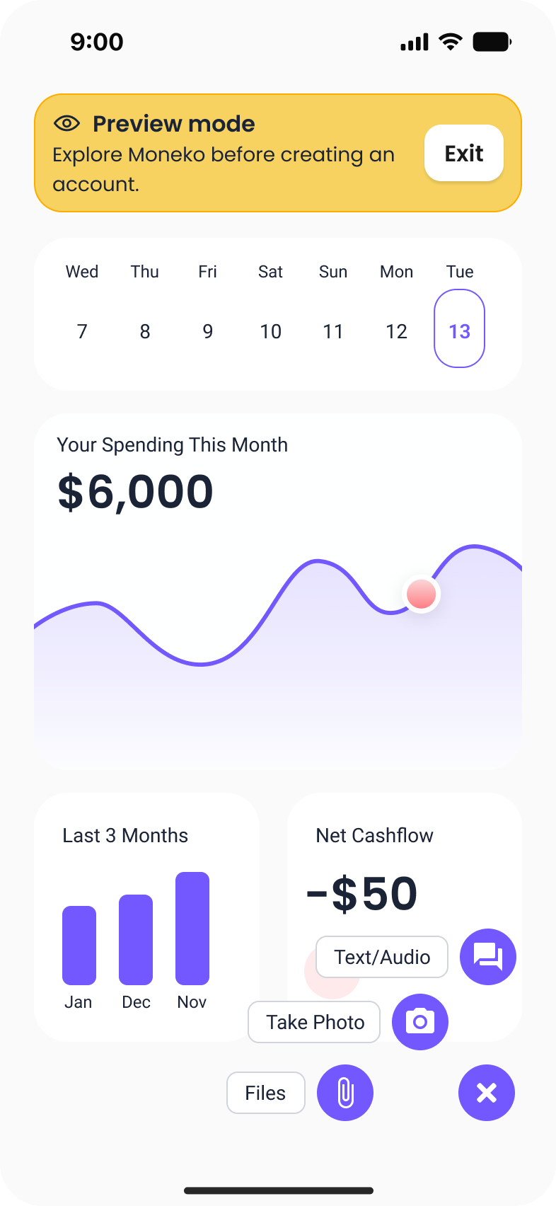
V3 removed mandatory account creation and payment so users could enter Moneko and explore. V4 built on that access by guiding users toward a personalized budget and their first expense.
Removing mandatory registration and payment allowed users to enter Moneko and explore the product before committing.
Removed required registration and upfront payment.
Access alone did not guide users toward a meaningful first action.
In the observed V3 cohort, purchases were followed by cancellations; the comparison doesn’t explain why.
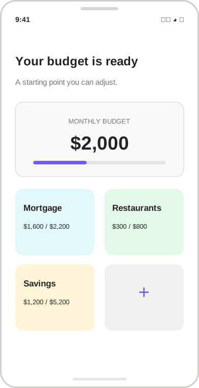
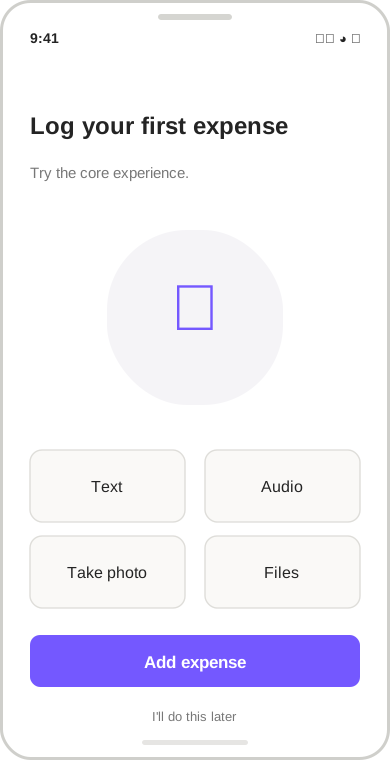
Guided users to create a personalized budget and log their first expense.
Delayed the subscription decision; longer-term monetization and retention still needed validation.
Users could build a budget and log an expense before deciding whether to subscribe.
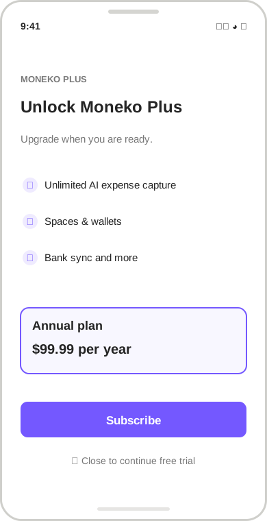
Keep an immediate subscription offer available while allowing users to dismiss it and reach Moneko's core features.
Preserve the paywall, but let users dismiss it and continue using Moneko's core features.
Final Design · 06 · Shipped May 16
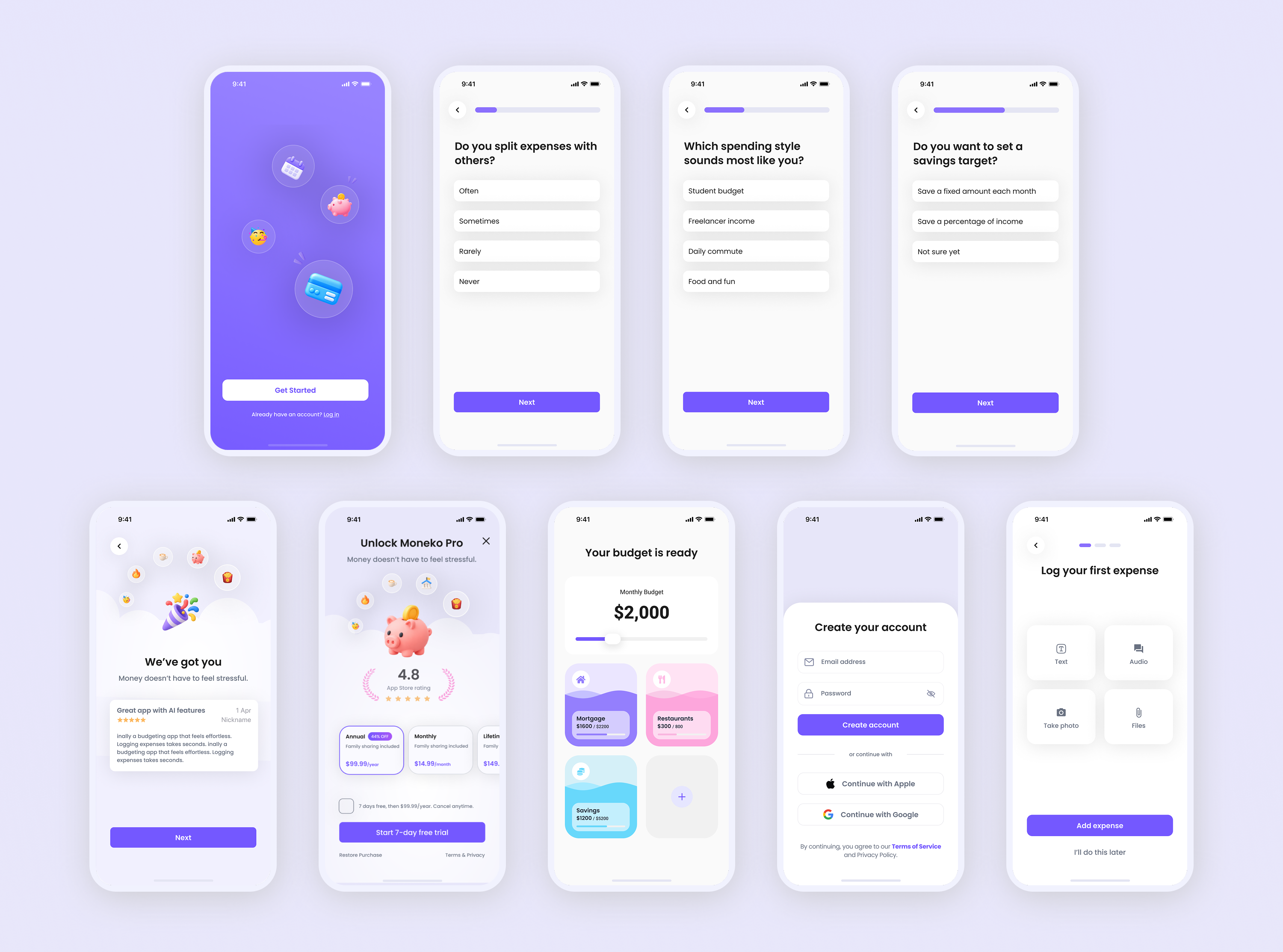
Ask relevant questions to tailor the experience to users' needs.
Turn onboarding answers into a personalized starting budget.
Introduce expense logging so users can experience the core workflow.
Keep the subscription option available while allowing users to continue exploring.